Consumer packaging
What I love most about package design is the opportunity to be creative with physical media. With my extensive print background, I'm always excited to work on projects where I can explore formats, dielines, labels and materials.
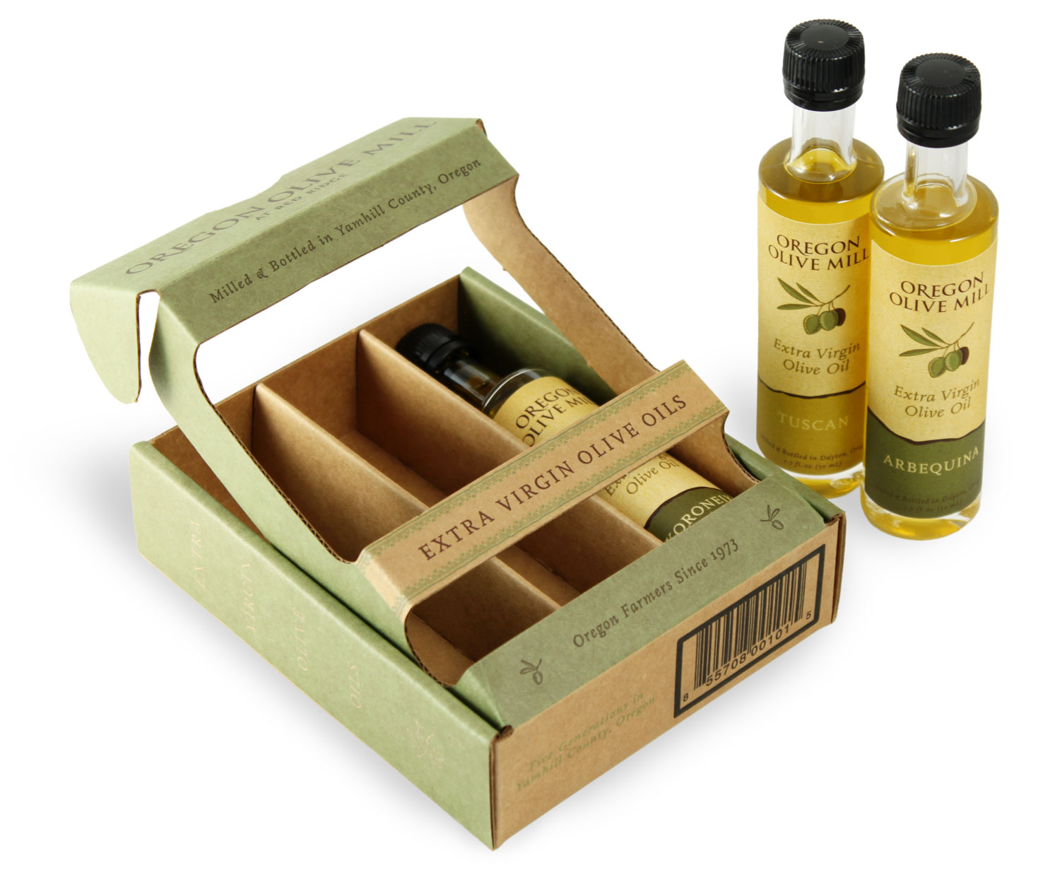
This design serves as an example of process responding well to constraints, as we carefully selected from a range of existing formats in order to find the right material to convey this client's brand.
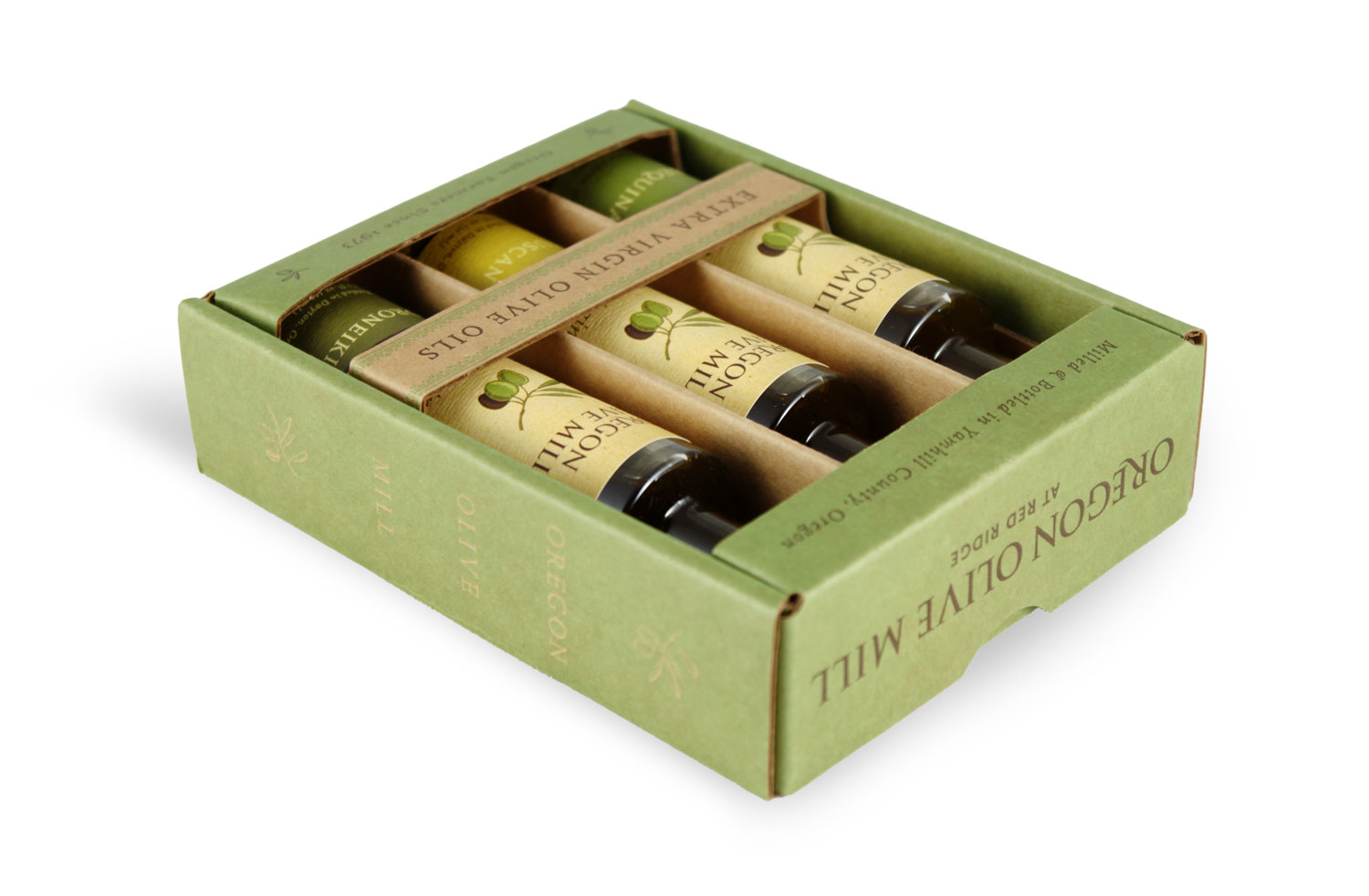
I considered everything from the weight of the package to the way the corrugation in the cardboard would play off patterns in the design. The result was a cohesive design that would hold its own in a retail setting.
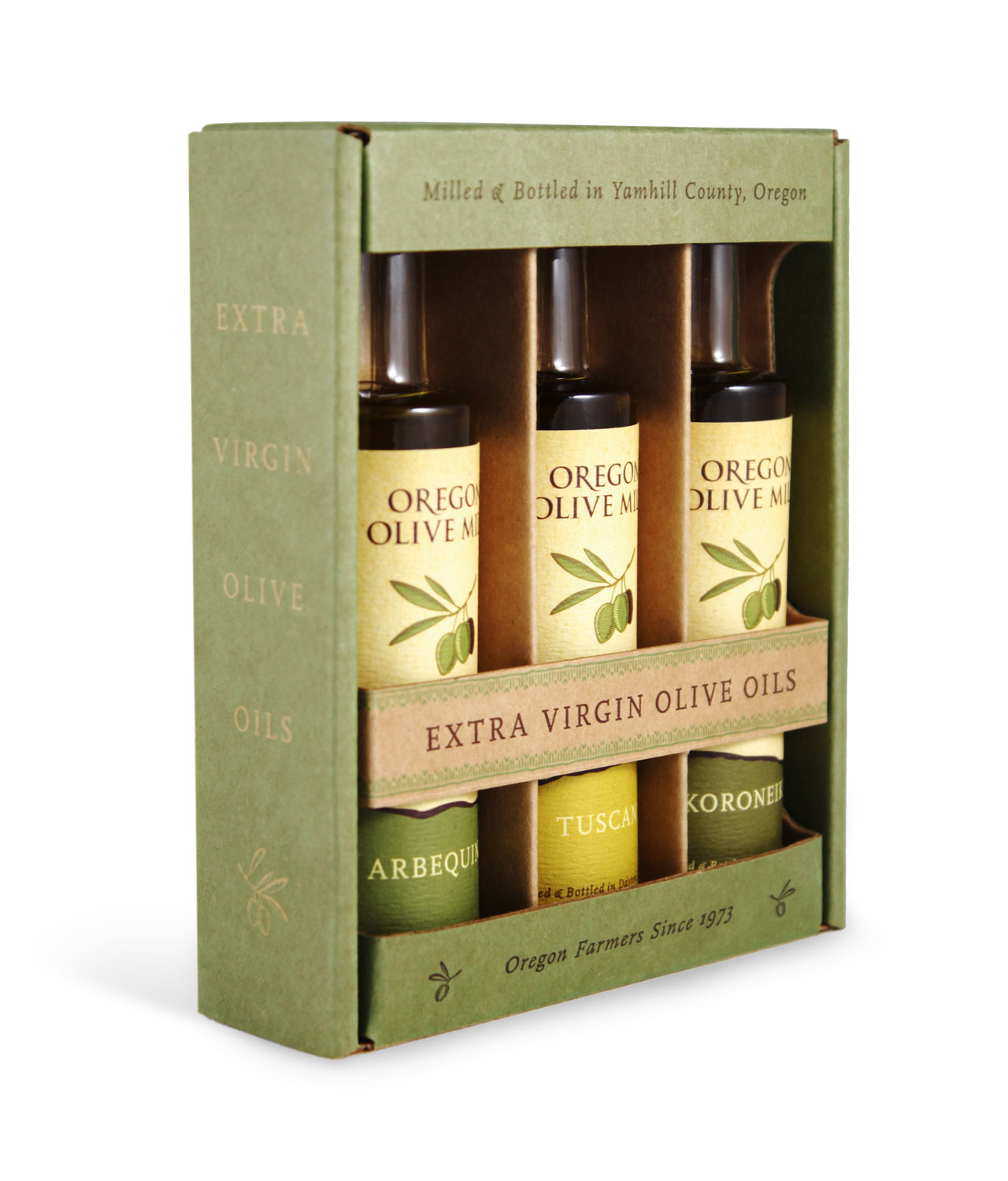
Each surface was integral in establishing the narrative of the piece. For the front we let the glass bottles, as well as the oils themselves, play off the illustrations and texture of the labels, and used the side panels to cultivate a natural mood through a simple use of color and text.
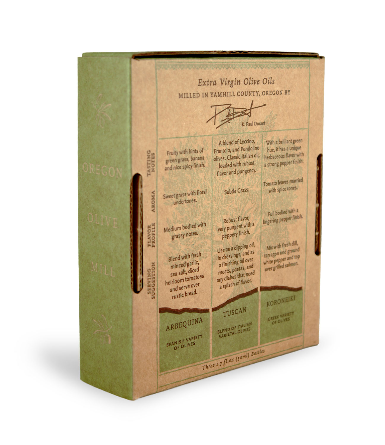
The back panel was where we emphasized the more data-oriented aspects of the product's appeal. We went for a layout that would feel structured, informative and vaguely technical, while maintaining a sense of dignity and invitation.
Related Projects
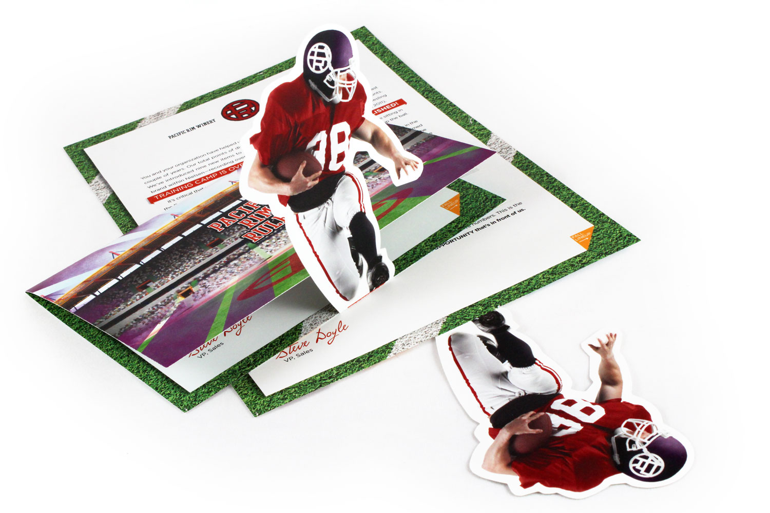
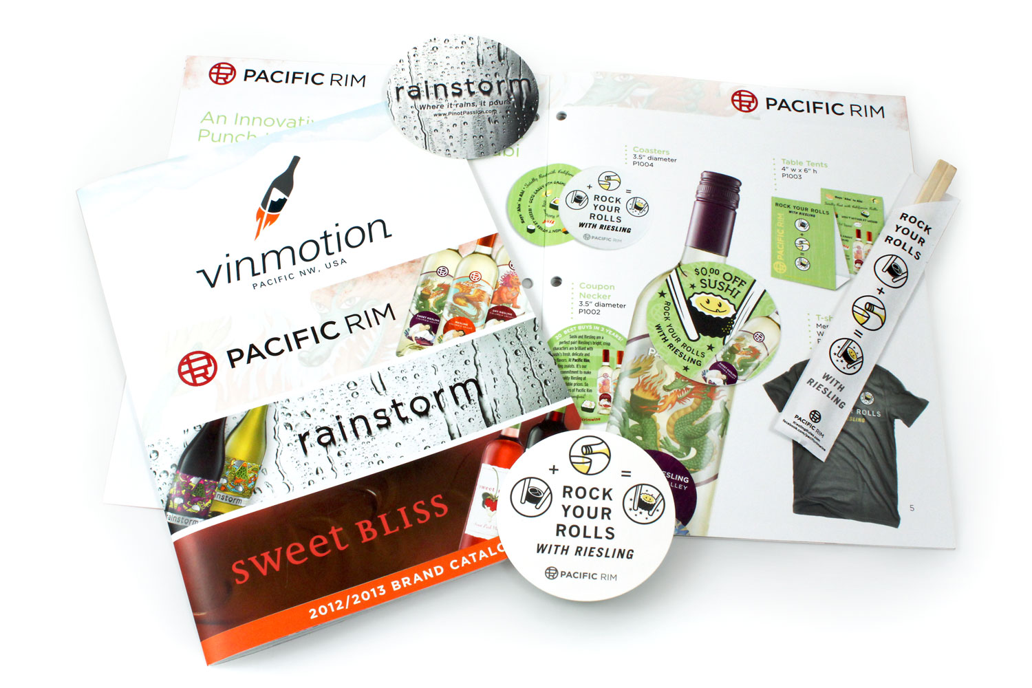
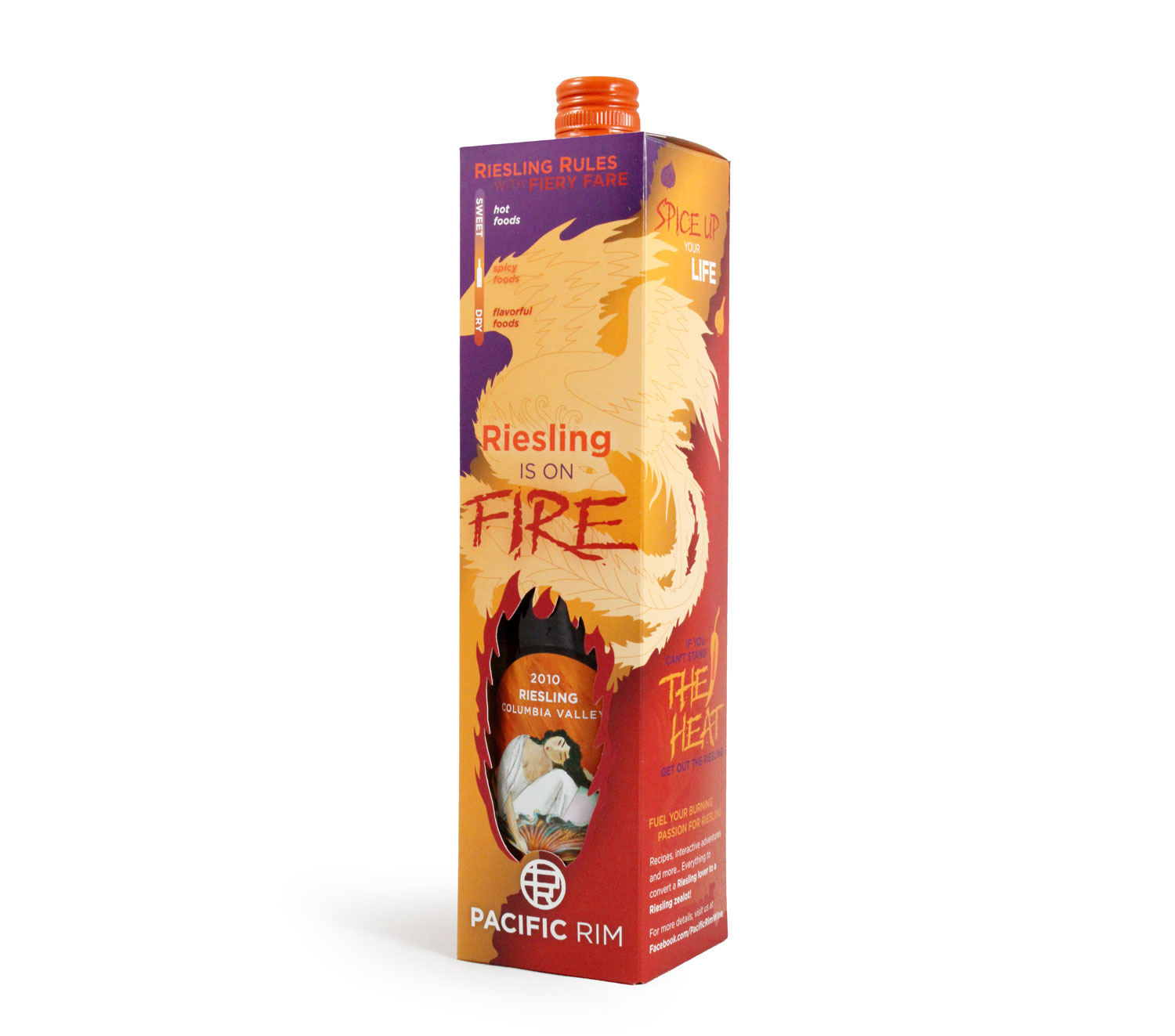
Other designs I created at Grow Creative, where the above project took shape, included brochures, promotional campaigns and (you guessed it ;) additional packaging.